PKoffee Analysis example
Welcome to the PKoffee project analysis notebook! ☕️
This project aims to analyze the relationship between coffee consumption (in cups) and productivity. We use several mathematical models to find the best fit for our data.
Project Structure
pkoffee/data.py: Data loading and cleaning.pkoffee/parametric_function.py: Definition of various models (Quadratic, Logistic, etc.).pkoffee/productivity_analysis.py: Logic to fit models and rank them.pkoffee/visualization.py: Utilities to plot results.
[1]:
import sys
from pathlib import Path
import os
from pkoffee.data import load_csv
from pkoffee.productivity_analysis import fit_all_models, format_model_rankings
from pkoffee.visualization import plot_models, Show
1. Load the data
The experimental data are in file ../analysis/coffee_productivity.csv
[2]:
# Load the data
data_path = Path("../analysis/coffee_productivity.csv")
data = load_csv(data_path)

print(f"Loaded {len(data)} data points from {data_path}")
data.head()
Loaded 200000 data points from ../analysis/coffee_productivity.csv
[2]:
| cups | productivity | |
|---|---|---|
| 0 | 9 | 0.424316 |
| 1 | 8 | 0.589516 |
| 2 | 9 | 0.397615 |
| 3 | 10 | 0.256125 |
| 4 | 10 | 0.255150 |
2. Model Fitting
We will now fit several parametric models to the data:
Quadratic: \(f(x) = a_0 + a_1 x + a_2 x^2\)
Michaelis-Menten: \(f(x) = y_0 + V_{max} \frac{x}{K + x}\)
Logistic: \(f(x) = y_0 + \frac{L}{1 + e^{-k(x - x_0)}}\)
Peak Model: \(f(x) = a \cdot x \cdot e^{-x/b}\)
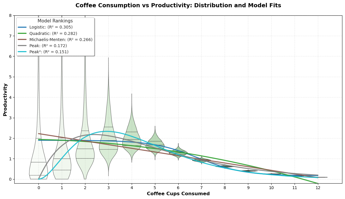
The fit_all_models function will run the optimization for all these models and rank them using the \(R^2\) score.
[3]:
# Fit all models
fitted_models = fit_all_models(data)

# Print rankings
print("Model Rankings (by R²):")
print(format_model_rankings(fitted_models))
Model Rankings (by R²):
Model Rankings:
══════════════════════════════════════════════════
Rank   Model                R² Score
══════════════════════════════════════════════════
1      Logistic             0.3051
2      Quadratic            0.2815
3      Michaelis-Menten     0.2662
4      Peak                 0.1724
5      Peak²                0.1511
══════════════════════════════════════════════════
3. Visualization
Finally, we visualize the data distribution using a violin plot and overlay the fitted model curves to see which one accurately captures the “coffee sweet spot”.
[4]:
plot_models(data, fitted_models, show=Show.YES)